
Mobile and PWA
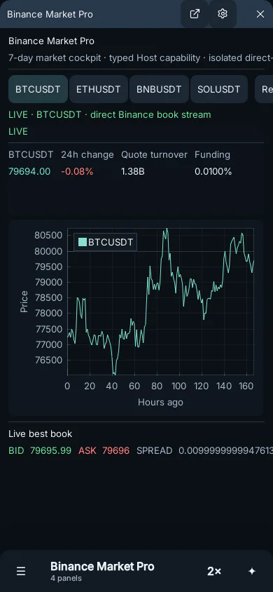
Click enters mobile presentation when the shortest viewport side is under 700 CSS pixels. /mobile forces the mode. This is a presentation setting over the same workspace—not a second application and not a destructive layout conversion.
Presentation rules
Section titled “Presentation rules”- Single-panel is the default.
- Optional split shows two selected instances.
- Portrait places the split top/bottom; landscape places it left/right.
- Rotation reflows the split but never writes over the desktop dock tree.
- The bottom bar contains menu, current panel/split picker, presentation control, and agent access.
- Host selection lives inside the mobile menu to preserve working space.
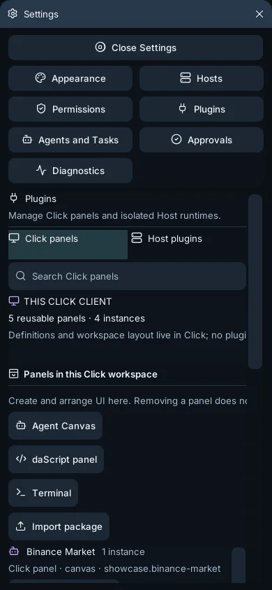
Management windows become full-screen sheets on mobile. Their content, not the title bar, owns vertical gestures. Kinetic scrolling tracks touch velocity and decelerates with native-feeling momentum. Controls use at least 48 CSS-pixel targets, while non-draggable presentation allows thinner panel borders.
Install as an app
Section titled “Install as an app”In a supporting browser, open its install menu and choose Install app or Add to Home Screen. The PWA keeps Click’s static shell available offline, but Host-backed panels still need a Host connection. Queued workspace mutations reconcile after reconnect according to the normal revisioned synchronization rules.