
Themes and accessibility
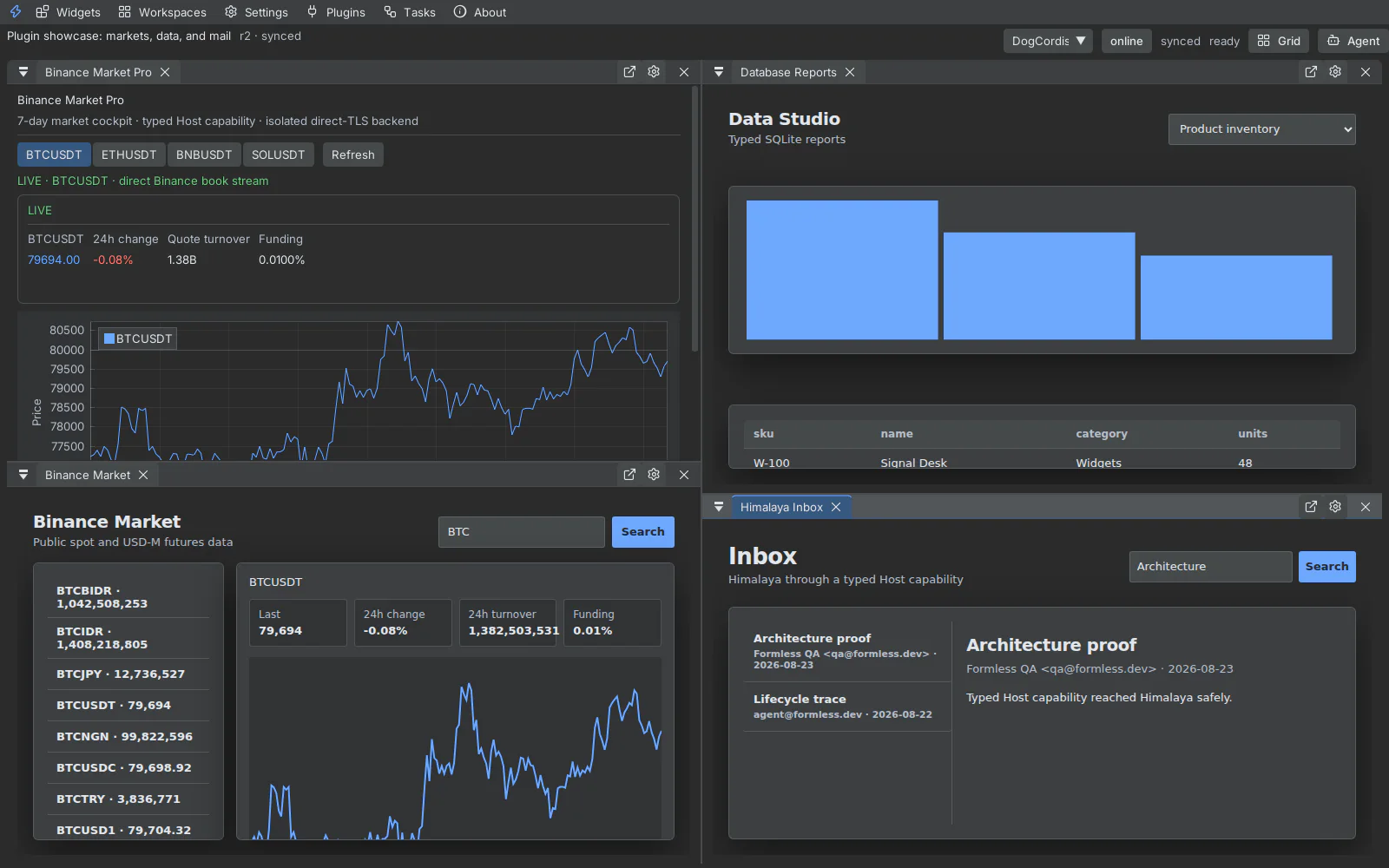
Click ships one semantic design system across native ImGui, daScript, shell DOM, terminal chrome, and sandboxed Canvas panels. Theme changes use a revisioned handshake so a Canvas acknowledges only after applying variables and reporting resolved colors.
Available identities include Default, Modern, Classic Dark, High Contrast, Light, Midnight, Ember, Ultra, Darcula, and Catppuccin Mocha. Default retains black/lime; Light resolves first-party Canvas surfaces to light tokens rather than leaving dark panel CSS behind.
Controls
Section titled “Controls”- Theme: changes semantic surfaces, text, focus, status, and chart colors.
- Density: adjusts control and layout spacing without scaling text.
- UI font and rendering font: select appropriate interface and terminal faces.
- Font size: scales native and browser-backed surfaces together.
- Reduced motion: snaps native springs and sets browser transition durations to zero.
Keyboard
Section titled “Keyboard”Use Tab and Shift+Tab to move through custom controls, Enter/Space to activate, arrow keys inside tab/segmented controls, and Escape to close the topmost popup or modal. Visible focus rings use semantic focus tokens in every theme.